Refreshing a classic.
There’s nothing we love more than a good cuppa in the Boldinc studio, so when Tetley came to us with their packaging challenge we did what we do best, put the kettle on and talked it over.
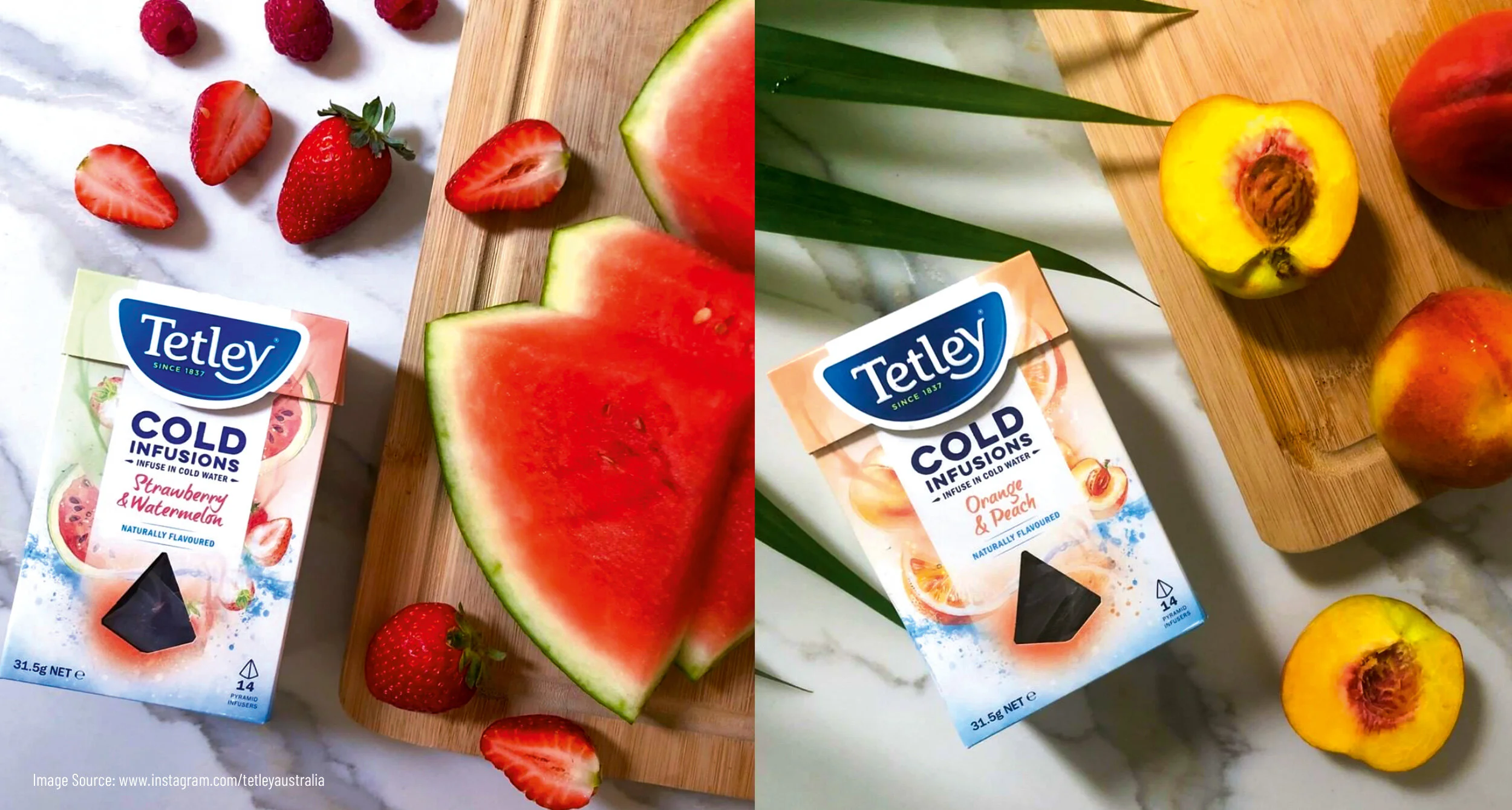
What became clear is that although Tetley is well known, it was considered a ‘nanna’ brand that lacked the potential to innovate amongst one of the supermarket’s fastest growing categories. Working closely with the Tetley team, we developed a refreshed brand positioning that had the depth and agility to keep up with fast paced innovation & NPD. Flavour, tradition, health, craftsmanship, ritual and premiumisation – we needed a brand that could tell all these stories at different times to get to the heart of the consumer benefit for each innovation.
“The updated identity harnesses the pride and strength of the Tetley brand – intentionally steering clear of the artificial graphics that are prevalent in the category. The packaging drives craftsmanship through typography and meaningful detail, with each variant having its own distinct style and personality relevant to the product to carve out a unique space.”
Deliverables: Brand Positioning / Packaging / Innovation Pipeline


Like to find out more?