Le Petit Rosé
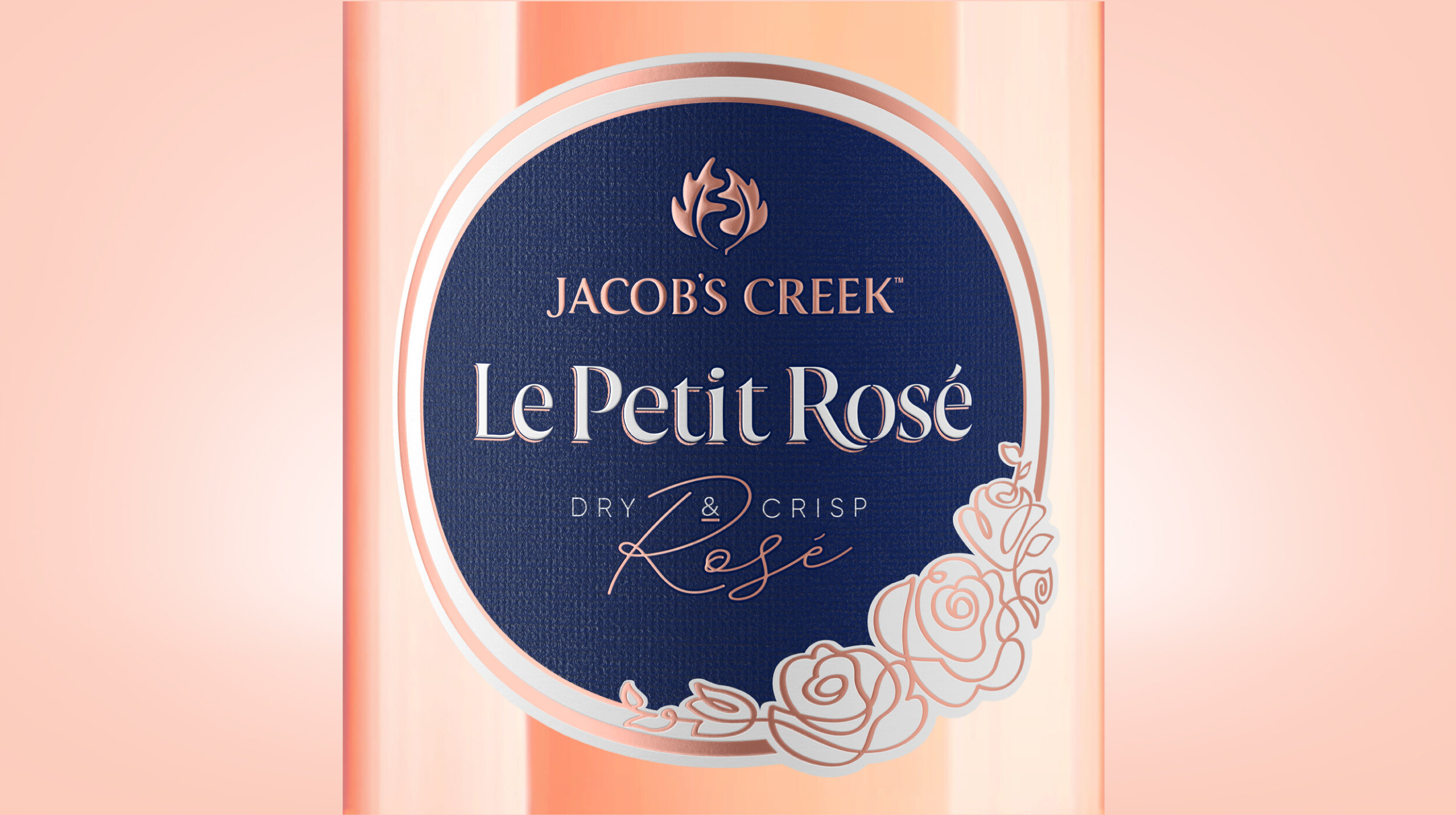
For consumers on their way to relaxed but stylish get togethers with friends, the rosé they chose was often an extension of their own personal style. We needed to recapture our place as the understated, timeless leader in a category saturated with overt, personality driven offers.
Relaxed Parisian typography was paired with a contemporary illustration style to arm the brand with a more distinctive presence on shelf, and more importantly - a stylish lifestyle driven platform for off pack activation.

Le Petit Rosé | Limited Edition
The cheeky little rosé with a timeless style. This limited edition packaging brings a relaxed sophistication to any Mother’s Day lunch or Valentine’s dinner. Working with renowned botanical illustrator Heidi Willis, we honoured the essence of Le Petit Rosé: premium elegance with a French twist. Not just a pretty face, the design alone resulted in a +23% uplift in sales volume and won silver for limited edition packaging of a wine brand in the 2020 Wine Design Challenge.
Deliverables: Limited Edition Packaging

Jacob’s Creek Sparkling | Limited Edition 2019
How do you capture the life-loving spirit and vibrant diversity of modern Australia in a way that speaks to local and international audiences alike? By collaborating with Japanese-Australian artist Go Suga we were able to tap into the best of both worlds and create a full-bottle wrap which captures the essence of “Aussie Summer Spirit” without the need for touristy clichés and kangaroos!
The distinctively feel good style was effortlessly brought to life across bright poster designs, in-store displays, and engaging social media animations, driving sales volumes up by +9%.
Deliverables: Limited Edition Packaging / Key Visuals / Animation / Social Media Content

Jacob’s Creek Sparkling | Limited Edition 2020
As our second limited edition, the focus was on producing a more sustainable but equally stunning limited edition for Jacob’s Creek sparkling for the Summer festive season. Teaming up with Australian textile designer Cassie Byrnes and her love of colour and nature, this pack captures the uniquely vibrant Australian flora and the lively sophisticated outdoor celebrations that are synonymous with the Australian Summer.
By using existing label footprints, materials and eliminating plastic, the design presented a beautifully disruptive but COGs neutral limited edition. That’s something to celebrate!
Deliverables: Limited Edition Packaging

Nature’s Craft Organic
With organic wine growing in demand, the biggest barrier to consumers picking up a bottle was a perceived risk of “organic” translating to earthy, funky flavours. The organic wine category had done little to address this, with a sea of boutique, crafty labels lacking the confidence and reassurance that our audience are seeking.
By leveraging the reliability of Jacob’s Creek, Nature’s Craft tells a story that elevates above the organic clichés. We hero the power of modern craftsmanship, when mankind works alongside nature to harness its unspoiled beauty. Represented by the coming together of the winemaker’s fingerprint and a cross cut of the actual grape vine. A feast for the senses, the rich, vibrant colour palette speaks to the taste appeal of the wine while the tactility of the label delivers a premium in-hand experience.
Deliverables: Brand Positioning / Packaging

Prosecco Spritz
Back in 2017, the spritz – a classic aperitivo – was increasing in popularity in Australia. Seeing the opportunity to be the first RTD Spritz in the market, Jacob's Creek launched Prosecco Spritz. Taking inspiration from sophisticated Italian tailoring, Boldinc designed a sleek pack – understated with premium detailing. The distinct angle provided a recognisable asset for beyond pack assets.
Deliverables: Packaging / Brand Guidelines
Like to find out more?


