The secret behind authentic Spanish smallgoods.
Hailing from a long line of artisan butchers from the region of Llerena in Extremadura, Rogelio Rodriguez Snr and his wife Elvira promptly began producing quality, authentic Spanish smallgoods upon their arrival in Sydney in the 1970's. Now a father and son team, they continue to uphold the family name, using the best meat cuts and traditional recipes passed on from one generation to the next.
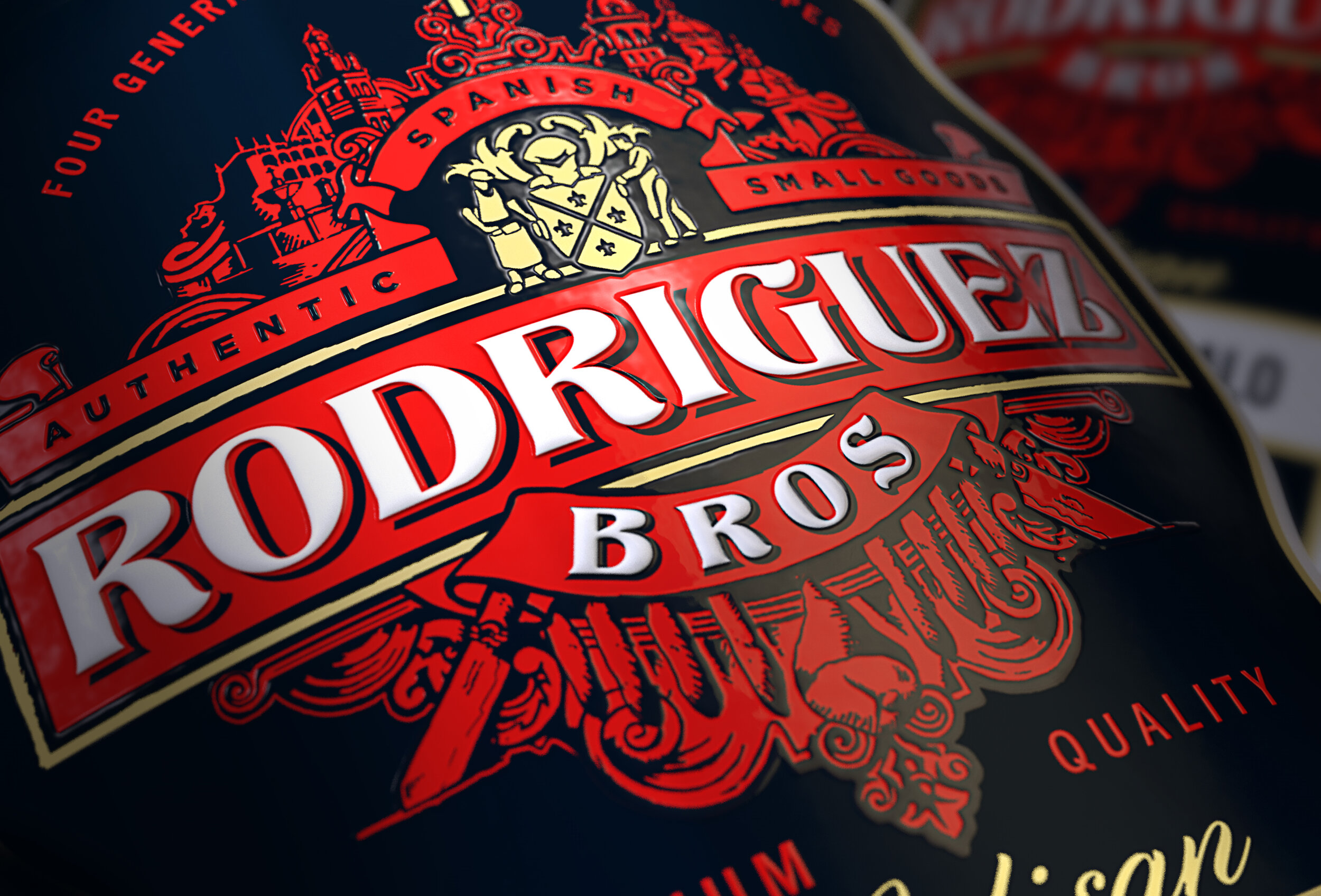
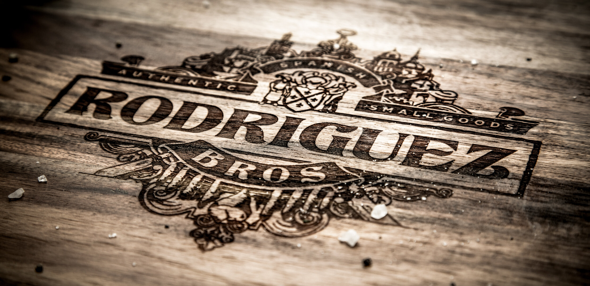
The trouble with being a pioneer is that you pave the road for others to follow. Our brief was simple – help Rodriguez Bros. reclaim their position as the authority in premium Spanish smallgoods. Inspired by what others could not imitate – the family’s story in reference to the four generations of Extremaduran butchers who made the town their home, the logo captures the uniqueness of their story. everything from the town’s distinct skyline, the family coat of arms, even the brothers themselves have been forged together into an emblem rich in history and meaning. All held together by the family key, symbolising the secrecy of the family recipes.
Deliverables: Brand Positioning / Brand Identity / Packaging
Like to find out more?


