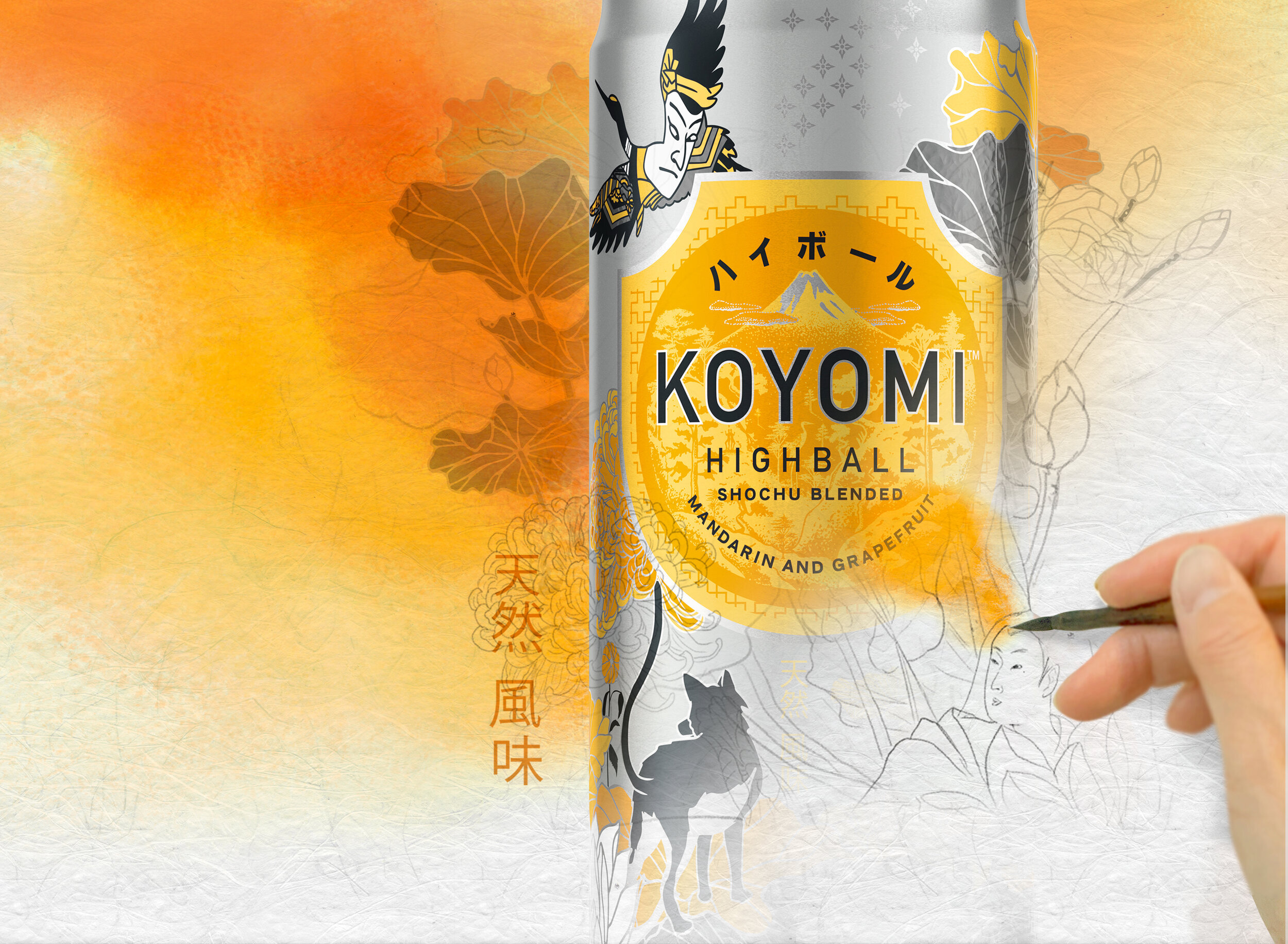
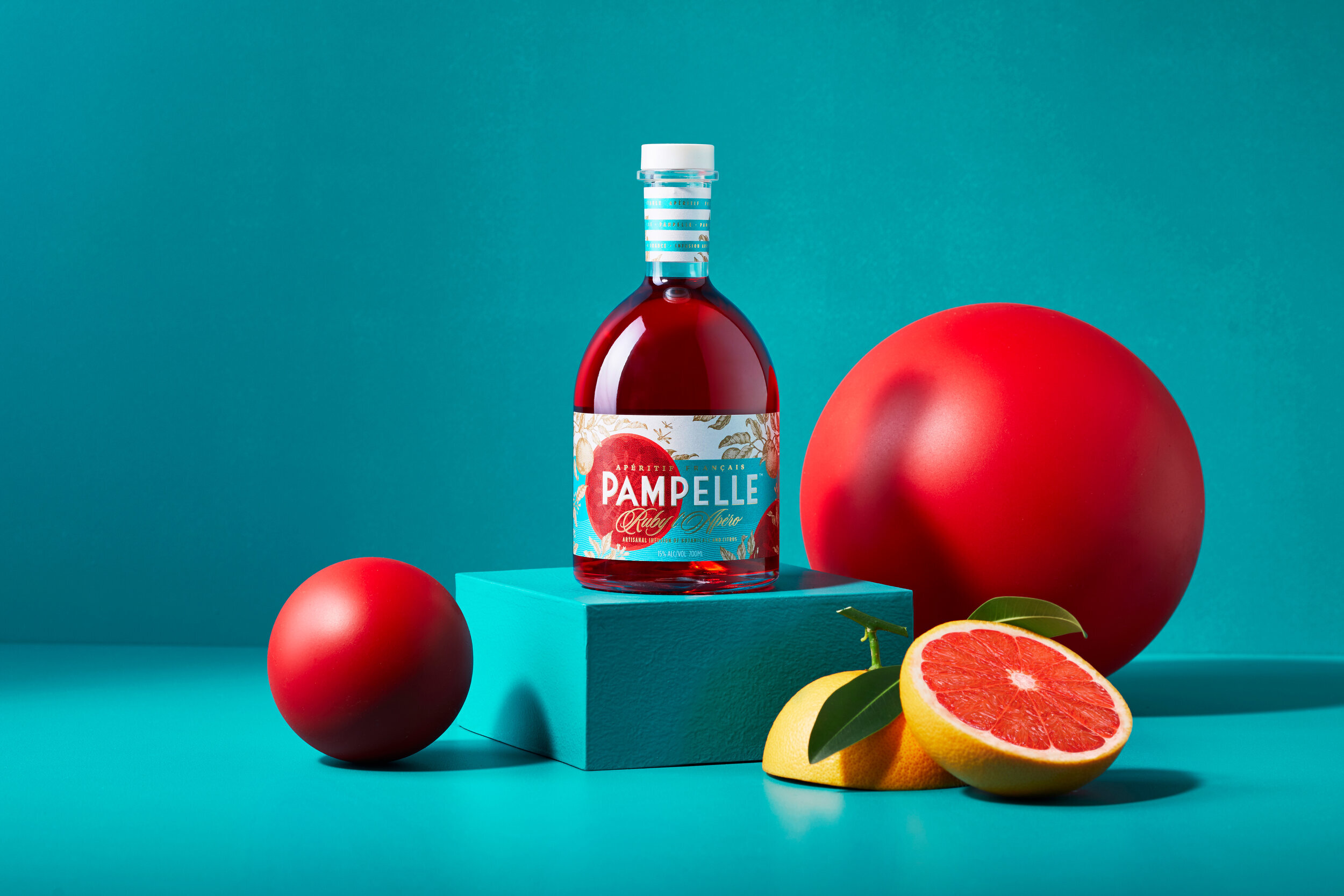
Taste it with your eyes
As with any fast growing category, brands who rise above what the product does and instead focus on what it enables are the ones who really stand out. In Kombucha’s case, gut health and wellness are a key benefit, but a saturated message in a cluttered market.
We understood consumers see these aspects as a cost of entry, which allowed us to focus our story on the guilt free enjoyment that Good Earth brings to the table. Unapologetically bright and playful, our one rule when designing the labels was that consumers should be able to taste them with their eyes!
Our distinctive illustration style captures the vibrant & flavourful nature of the product and of the brand itself. With the need for brands to exist beyond a piece of packaging, the graphics were specifically designed to seamlessly extend to digital expressions, allowing our bright & good natured personality to really come to life wherever the brand popped up.
Deliverables: Brand Positioning / Packaging
Like to find out more?


